Page Layout Designer
In this topic ShowHide
About this page
Menu path: RME
> Users > Page Views Search > Page Views > Layout Designer
button OR Configure Field Properties button
The Page Layout Designer allows you to customise Page Views by changing
field labels that display in the page, field properties such as access
type, and in some cases, alter the page layout and add design elements,
such as free text, group boxes, sections, tabs, or lines.
Each Page View has a default layout. When you create a custom Page View,
any properties that are changed and saved for that custom view apply to
the custom view only. The default view layout is independent to a custom
view layout. This means that if you create different Page Views for different
audiences, you will need to customise each separately.
Note: When you save a custom layout,
the Page View becomes customised (Use
Custom Layout = Yes).
Enhancements in a new release will not be applied to custom page layouts
in order to retain your defined personalisation unless otherwise specified
in the Release Notes.
Note that Page Views for Ethics Categories and Research Output Categories
are not configured via Page Views VIE001. They have separate Layout Designer
pages to cater for specific category configuration. See: Ethics
Category Layout Designer or Research Output Category
Layout Designer.
Dynamic page options
This page displays differently depending on whether the Page Layout
Designer is used for your institution (via the Page Layout Designer product
key), and if you have access to the required Page Views and permissions.
A quick way to tell is to see what displays in the Page View record,
as outlined in the table below:
Do not change these page layouts without consultation
Changing the layout for some special pages listed below requires advanced
knowledge of RME page structure to avoid impacts to functionality. Please
consult with the ResearchMaster team before altering the layout using
the Layout Designer button for
the following pages:
• CPT pages,
such as CPT013 to CPT024: Only change field labels in the default
layout. Do not create custom page layouts for CPT pages without consultation.
• Related item
tabs on the following pages: CON001, DAT001, PRO025, ETH022, ETH034, PUB029,
CON017, STU016, PEP016, COM010, FAC003, PAN009, EMT001, ETH001, FAC001,
FND001, STU021, PRO004, PRO008, PEP001, PRO001, PUB001.
Prerequisites
• This feature
is designed to be used on a PC. Due to the space required to view and
edit page layouts, it is not designed for tablets.
• When changing
a page layout, it is advisable that you should have some knowledge about
web design principles and an understanding of user experience design to
avoid usability issues.
• When changing
a page layout, you should be familiar with RME pages and fields, or obtain
advice from someone with RME experience.
Layout of the Page Layout Designer
The Page Layout Designer comprises of a toolbar across the top, the
"canvas" with a visual representation of the page layout, and
a right panel for field properties. If you can see a Use
Custom Layout button, a
Design panel displays on the left when you click it. Each of these elements
is explained in the sections below.
1. Toolbar
The toolbar provides some general options, and a few additional options
if the Page Layout Designer is licensed (button in the Page View = Layout Designer):
2. Design
panel
Only if licensed and Use Custom Layout
is selected
The Design panel on the left is where you can drag fields, related items
and design elements into your layout. When you add a field or related
item, it no longer appears in this panel, to prevent duplication. To
collapse each list, click the header of the section. For more, see: Customise a page layout below.
You can toggle the panel to minimise or display
it fully.
3. Canvas
The canvas in the middle shows the page layout.
• If
not licensed (button in the Page View = Configure
Field Options), you can only select a field to display the details
in the Properties panel on the right for editing. You cannot move, add
or remove items in the page layout.
• If
licensed (button in the Page View = Layout
Designer), this is where you can change the layout. You can either
edit the default layout or design a custom layout. To add a field, related
item or visual element, drag it from the Design panel into the canvas.
You can also move these around in the canvas by dragging-and-dropping.
For more, see Customise a page layout
below.
4. Properties
panel
The Properties panel on the right displays the properties of a field selected
in the canvas. You can edit properties if you have the relevant permission.
For more, see: Configure field properties
below. You can toggle the panel to minimise
or display it fully.
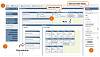
Click to show or hide:
Example Page Layout Designer page
Toggle Design and Properties panels
You can toggle the Design (left) and Properties (right) panels to keep
them open, or minimise them using the Pin icon at the top right. This
can be useful for allowing more screen space when you're not using a panel.
Panels are pinned open by default.
• To minimise
a panel, click the Pin icon at the top right of it  .
It will be minimised and display as a button on the side of the page.
.
It will be minimised and display as a button on the side of the page.
• To open a panel
temporarily when minimised, click the button on the side of the page.
The panel will display overlapping the canvas; the Pin icon will be shown
on its side.
• To pin a panel
open permanently, click the Pin icon again after opening it temporarily.
The Pin icon will be shown as upright.
 To make more space for the designer
on your screen, toggle the RME menu closed using the arrow icon at the
top left.
To make more space for the designer
on your screen, toggle the RME menu closed using the arrow icon at the
top left.
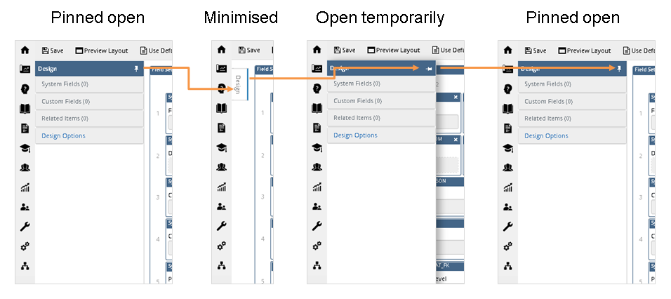
Examples panels and
icon in different states: pinned open, to minimised, to open temporarily,
then pinned open again
Configure field properties
If the Page Layout Designer is not used, or the page layout cannot be
changed for functional reasons, fields display in the current layout but
you will not be able to move or remove them via this page. You can only
highlight fields and change the field properties.
Each Page View has a default layout.
When you create a custom Page View, any properties that are changed and
saved for that custom view apply to the custom view only. The default
view layout is independent to a custom view layout. This means that if
you create different Page Views for different audiences, you will need
to customise each separately.
To change properties for a field:
1. Click the
field in the layout to select it.
2. In the Properties
panel on the right, edit the field properties. Some system field properties
cannot be changed.
3. In the toolbar,
click Save.
If you want to change the grid settings, return to the Page View page
and display the Page View Field for relevant
field/s.
Properties: Fields (depending on the type of field)
|
|
Access
Type |
Indicates whether the field
is required by the system to correctly function, if it is read-only,
or whether it is displayed in the page
Depending on the type of field, the following
options may be available in the dropdown:
• Hidden: The field will not be
displayed in the page view
• Optional: Data entry for the
field is optional
• Read Only: The value of the
field can only be viewed, not modified
• Required: Data entry for the
field is mandatory; the page will not save until a valid value
is provided
Conditional Required
fields
Some fields are conditionally Required
(mandatory) based on the value of another related field. System
settings like this override the Access
Type setting in the Page View. For example, in the User
record USE001, the Reason to
Deactivate and Date Deactivated
fields become required when the Account
Inactive? flag is changed to Yes.
In the USE001 Page View however, the
Access Type for both fields is set as Optional.
This reflects the field setting for the default Account
Inactive? value of No.
You cannot change conditional system field settings.
Change the access type
for System Required fields
Some fields are marked in the System
Required item in
the panel as
Yes (see below in this table). These are fields that need
a value for a system function. If you want to create a Page
View for a specific role in which you want to make System
Required fields as read only so they cannot be edited,
you can change the Access Type
property to Read Only
or other options. However, this is only designed to suit specific
roles where it is assumed that required fields in the relevant
Page View/s will already have a value, and that users with the
specific role will not be creating new records. They will only
need to view the details and interact with limited elements in
the page.
If a new record is created by a user where a System Required field has been
set with an Access Type
of Read Only, Hidden
or Optional, the field
may be blank which may be detected in system validation and prevent
saving. For this reason, it is not recommended to change
settings of System Required
fields without due care and consideration. |
Allow
Bulk Update |
Only for Ethics Core (ETH001) and
Project Core (PRO001) pages
Indicates whether you want to allow this field
to be available when updating core records in bulk
This works along with the Allow
Bulk Update page action which you assign to specific roles
or users in Page Views. When assigned, users with this action
will be able to use the Bulk
Update function.
See: Bulk Update
This is disabled if
the field is a system read-only field, an eCode or a title field. |
Category
Group |
Read
only; only for fields with a defined category group, such as dropdowns
Indicates whether the field displays a list based
on a specified category group (by table name), sourced from Categories
If a category group is defined, you can set a
default that will display automatically in the field for this
Page View in the Default Value
field, from a list based on this category group. |
CSS
Class Name |
Free
Text design element only
Exact name of a custom class included in custom
and/or user preference style sheets.
If entering a class name for a custom font, do
not select a font style from the text toolbar in the Text
field, or the style will be overridden.
For more about custom and user preference style
sheets, refer to the RME Installation and Upgrade Guide document. |
Default
Value |
Only
for fields that can have a default value set, such as dropdowns
Default value you want to display automatically
in the field in this Page View
If the field has a Category
Group defined, a dropdown allows you to select from category
items. This field does not automatically display the default set
for a category group in Setup > Categories.
The selected default in this Page View overrides the default set
for the category group.
Project Type,
Contract Type, Ethics
Category and Funding Activity
dropdowns are used for data security access. In a core record,
if the user does not have access to the set default category item,
the dropdown displays as Please
Select with a list of current category items. For more,
see: Data access security
process |
Default
View |
Only
for the Section design
element; Default = Expanded
Controls whether the section is expanded by default
when a user goes to the page, or is collapsed.
When the Design
View = Collapsed,
if there is a mandatory field inside the section, when a user
first creates a new record based on the Page View, any section
that contains one or more mandatory fields will not be collapsed
so that mandatory fields are visible. Post-creation, when the
page is visited, the default view is applied as defined in the
section properties. This is to ensure that mandatory validation
messaging is visible so that mandatory fields are completed. This
does not apply to sections within sections. See: Sections |
Description |
Details to explain what the
field is used for
This is only displayed in the Page View and the
Page Layout Designer - it is not displayed to end users elsewhere
in the system. |
Label |
Name of the field that will
be displayed in the selected Page View
 If a label displays in square brackets, for example, [Project],
you must keep
the brackets in place. This indicates that the label is used globally
and is customised via Global Label Preferences. If you remove
the brackets, the global labels you have set will not be applied.
See: Global Label Preferences
If a label displays in square brackets, for example, [Project],
you must keep
the brackets in place. This indicates that the label is used globally
and is customised via Global Label Preferences. If you remove
the brackets, the global labels you have set will not be applied.
See: Global Label Preferences
|
Restore
Defaults |
Used to return all the field
properties to the original default RME settings |
System
Field Key |
Read
only
System field label that is used in the database
tables |
System
Read Only |
Read
only
Indicates if the field is read only in the page
This is usually because the field value comes
from elsewhere in the system. The value must be maintained in
the source page.
The access type for a System Read Only field can
only be either Hidden
or Read Only. |
System
Required |
Read only
Indicates if the field is mandatory to support
a system function
Refer to notes for the Access
Type field above. |
Text |
Free Text design element only
Text to display in the RME page
Use the text toolbar to apply text styling, such
as bold, italic or bullets, or include links or images.
If you have entered a class name for a custom
font, do not select a font style from the text toolbar, or the
style will be overridden. |
Title |
Only
for some Design Option elements
if the Page Layout Designer is licensed
Label of the selected group box, section or tab
in the layout that will display in the page |
Customise a page layout
Only if the Page View button is Layout
Designer and you have the required access and permissions
You can drag-and-drop fields to add or remove them, change the position,
create sections or groups of fields, add, remove or reorder tabs, and
add a horizontal divider line.
Layout changes made for a custom layout
that are saved apply to the custom layout only. The default layout is
independent to the custom layout. Each Page View has its own custom and
default layout. If you create different Page Views for different audiences,
be aware that you need to customise each separately.
To customise a page layout:
1. Enable the
designer by selecting the Use Custom
Layout button on the toolbar.
2. Drag-and-drop
items from the Design panel on
the right into an empty space on the canvas, or move
items around. To remove items, click
the X in the top corner of the
item.
How
to drag-and-drop
• Click
an item, such as a field, to select it.
• Keep
holding the mouse-click while you drag the item into an empty space on
the canvas. As you hover over the canvas, dotted lines appear over the
spaces in which the item will be placed when you "drop" it.
You can only add or move an item to an empty space that will fit the default
size.
• Let
the click go to "drop" the field into position.
3. If adding
a group box, section or tab, click to select it and drag it into an empty
line. In the Properties panel
- Title field, enter a relevant
name to display in the page for the item.
4. To see how
the page will look, select the Preview
Layout button on the toolbar.
5. When you are
happy with your changes, select Save.
If the Page View is assigned to one or more roles, or has the highest
precedence, if more than one exists, it will be displayed to users. In
the Page Views search page, the Use Custom
... column is ticked to indicate that a custom layout is applied.
Note: When you save a custom layout,
the Page View becomes customised (Use
Custom Layout = Yes).
Enhancements in a new release will not be applied to custom page layouts
in order to retain your defined personalisation unless otherwise specified
in the Release Notes.
Click to view: Rules
Options in the Design panel
(in order) include:
Click to view or hide:
Examples of design options in a Page View
Add a field
To add a field, drag-and-drop it from the Design
panel. You can add a field directly in a spare space in a layout, or within
a group box, section or tab.
• The
default size of a field is 3 spaces wide by 1 space high on the canvas.
There must be enough spare space for this in the layout, so you may need
to move some fields around.
• You
can add custom fields anywhere on the canvas.
Add a related item
Related items are displayed in tabs within a core record by default.
We recommend adding a related item in either the tab set at the bottom
of a core record page, a separate tab (default) or in a collapsible section.
While you can add a related item directly in the layout or in a group
box, the summary grid for it will display and cannot be collapsed, which
will take up a lot of space.
To add or move a related item:
1. If moving
the related item and it is already in the layout, click the x
in the top of it to remove it. It will return as an option in the Design panel on the left. Then follow
the steps below to add it where you want it.
2. If adding
it to the existing tab set for a core record page, such as the Project
record page PRO001, select the green +
Add tab at the end of the tab set. This adds the new blank
related item tab. You may want to move the tabs around within the set.
3. If adding
it to a section, there must be a full empty line to place it. If there
is no empty line, make space by adding a new line at the bottom of the
tab set or section using the green plus +
icon, then moving all the elements down to create the empty line for the
new element. Add a tab or section
following the instructions below for these design options.
4. Go to the
Design panel under Related
Items and drag-and-drop the related item into the tab set, tab
or section.
5. In the Properties
panel on the right, replace the New Tab,
or New Section placeholder with
the title you want displayed for the tab or section. When naming, be aware
that the default size of a tab is 12 spaces wide by 1 space high on the
canvas.
6. If you want
to display a custom label for the actual related item page in place of
the default, go to the separate Page View for the related item. For example,
for the Projects record > Fund Scheme related item, go to the PRO007
Page View and change the name of the related item.
• Related
items will always contain the usual options for Add,
Delete and Export
in the actual page, even though these don't display in the Designer.
• If
a user has not been assigned the Page View for a related item, they will
not see it in the page. If there is a tab set or section containing only
related items which the user has not been assigned, that tab set or section
or tab will not be displayed for them.
Add a group box
To add a group box with a border and title:
1. Make room
in the layout for the new group box. There must be a spare line to place
the group box into. If there is no space you can make space by adding
a new line at the bottom of the layout using the green plus + icon, then moving all the page elements
down to create the empty line for the element.
2. In the Design
panel, display the Design Options and
drag-and-drop a Group Box into
an empty line.
3. Drag fields
or other items into the group box.
4. Click the
group box to highlight and display the Title
field in the Properties panel. Enter the title for the group box to display
on the page.
• The
default size of a group box is 3 spaces wide by 3 spaces high in the canvas.
You can change the width to suit.
• This
option is designed for grouping fields that are related or of a similar
type together. While you can potentially use it for other reasons and
add related items, and even sections, you may find you need to adjust
sizes for the best look.
• You
can add more columns or rows by clicking the green plus + icon.
• For
usability, avoid too many groups within groups.
Add a section
To add a collapsible/expandable section with a title (will display as
expanded when the page is opened unless the section Default
View property is changed to Collapsed):
1. Make room
in the layout for the new section. There must be a spare line to place
the section into. If there is no space you can make space by adding a
new line at the bottom of the layout using the green plus + icon, then moving all the page elements
down to create the empty line for the element.
2. In the Design panel, display the Design Options and drag-and-drop
a Section onto an empty line.
You may need to make space for it.
3. If you want
the section to display as collapsed when users view the page, in the section
Properties, change the Default View
to Collapsed.
When the Design
View = Collapsed, if there
is a mandatory field inside the section, when a user first creates a new
record based on the Page View, any section that contains one or more mandatory
fields will not be collapsed so that mandatory fields are visible. Post-creation,
when the page is visited, the default view is applied as defined in the
section properties. This is to ensure that mandatory validation messaging
is visible so that mandatory fields are completed.
The above behaviour does not apply to sections within sections that involve
mandatory fields. In a section with mandatory fields within a parent
section, mandatory validation messages for the collapsed child section
will be hidden. If data is not entered in mandatory fields, the record
cannot be saved. Avoid using sections with mandatory fields within another
section.
4. Drag fields
or other items into the section.
5. Click the
section to highlight it and display the Title
field in the Properties panel. Enter a title for the section to display
on the page.
• The
default size of a section is 12 spaces wide by 3 spaces high in the canvas.
You can change the width to suit.
• You
can add more columns or rows in the section by clicking the green plus
+ icon.
• For
usability, avoid too many sections within sections.
Add a tab
To add a tab:
1. Make room
in the layout for the new tab. There must be a spare line for the tab.
If there is no space, add a new line at the bottom of the layout or existing
tab set using the green plus +
icon, then moving all the elements down to create the empty line for the
new tab.
2. In the Design panel, display the Design Options option and drag-and-drop
a Tab into the new line.
3. Click
Add tab within the tab and drag
an item into it. If you want more than one tab to display in a row of
tabs, as in the RME default layout for related items, create a tab set
by adding more items to the tab.
4. If you want
to change the order in a row of tabs, see: Move
items around.
5. Click the
tab to highlight it and display the Title
field in the Properties panel.
Enter a title for the tab to display on the page. For a set of tabs, highlight
each tab within a tab set to enter a title as well.
• The
default size of a tab is 12 spaces wide by 3 spaces high in the canvas.
You can change the width to suit.
• You
can add more rows by clicking the green plus +
icon at the bottom. You cannot add more columns.
Add a horizontal line
To add a light grey divider line across the entire width of the page:
1. Make room
in the layout for the new section. There must be a spare line for it.
If there is no space, add a new line at the bottom of the layout using
the green plus +
icon, then move all the page elements down to create the empty line for
the line.
2. Go to the
Design panel, display the Design Options,
and drag-and-drop a Horizontal Line into
an empty line.
• The default
size of a horizontal line is 12 spaces wide by 1 space high in the canvas.
You cannot re-size this line.
Change the width of an item
You can increase or decrease the width of an item after placement on
the canvas.
To change the width, select the field and mouse over the side you want
to change so that an arrow displays. Drag it to a size that will suit
the field data.
• If increasing,
there must be enough empty space next to it.
• If decreasing,
be wary of making the item too small for the data that will be displayed.
Too many small fields may also make the page look very "busy".
Move items around
Select a field or design option (except tabs) and drag-and-drop it to
an empty space in the canvas. You can only move an item into an empty
space that is large enough to fit it. If it is too big for the space you
have in mind, re-size it and then move it. Be mindful of the data that
the field will display.
If you want to move something into the middle of the page, you need
to move other elements down (or up) to create an empty line for it.
Move tabs within a tab set
For a series of tabs, select a tab so it is highlighted and drag it
to the position you want to place it in the row (over another tab) and
drop it.

Example: Moving a
tab in a series of tabs
Remove an item
To remove an item from the canvas, click the cross x
at the top right of it. The item will display under the relevant section
in the Design panel.
When you delete a group box, section or tab group, all fields within
it also return to the Design panel.
Take care when deleting large groups of fields. If you make a mistake,
you either have to go back to the default layout to get them back, or
reconstruct the group.
Reapply the default layout
If you are designing a custom layout, there are two options to reapply
the original default layout if you change your mind, depending on whether
you want to use the default as a base for a new custom layout, or if you
just want to reapply it with edits.
Want to go back to the original, default layout to start over with new
edits? Select the Restore Default Layout
button and accept the confirmation dialog. This discards any unsaved changes
you made, and returns the layout to the original default layout in edit
mode.
Want to apply the default layout with no edits? Select the Use
Default Layout button. This discards any unsaved changes, returns
to the original default layout, and turns off editing mode. Once selected,
this button label changes to Use Custom
Layout.
If you want to create a new custom layout at any time, select Use Custom Layout. Layout functions
are available so you can edit it. The last custom layout you saved displays
in case you want to use it as a base for your new layout. If not, you
can revert to the original, default layout via the Restore
Default Layout button.
Changing labels (names)
Changing labels, or the names, shown in the user interface to your users,
depends on the element, outlined in the table below:
Related topics
• Page
Views
• Page
View Fields - used to customise the grid for the record
• Global
Label Preferences
• CPT
label preferences
Product Key:
Modules - Page Layout Designer and Modules - Core
Page ID: vie003.htm

