 Administrators: To add custom information in the Home page, see: Custom Content.
In this topic Hide
This page provides information about the common layout of the system including menus, toolbars, options, popups, text toolbars, and system page structure.
The RME layout includes these common features:
1. RME menu: Along the left side of the screen is the main menu. For details, see: Main menu below.
2. ResearchMaster
name: Provides access to the RME Home
page. Home page information is generally provided by your institution
and may include a personalised dashboard, showing
at-a-glance summary information. You may also be able to create your own
dashboard.
Administrators: To add custom information in the Home page, see: Custom Content.
3. Breadcrumb trail: At the top of a page, a set of links shows you where you are in the RME system. You can select a link in this trail to display the linked page. See: Breadcrumb trail
4. ORCID options: Option to register a user's ORCID iD, or create one. Once registered with RME, the user can click the icon to view their ORCID account details. See: ORCID options
5. Online Help: To the top right is a link that displays RME online help. When you are viewing a page in RME, click Help to view the help content related to that page (not for eForms). See also: How to use online help
6. Session menu: At the far right your username displays. From this, a dropdown menu provides options to log out and manage your own settings. See: Session menu
7. Toolbar: Across the top of core and eForm search pages, a toolbar offers quick access to common functions. See: Toolbar
8. Footer: At the bottom of each page, the RME version number is shown, as well as any additional custom content for your institution. See: Footer
9. Current system time zone: This displays the time zone set for the system (based on the settings in System Preferences, Time Zone Settings) at the bottom left of core pages (not for eForm pages or the Costing and Pricing Tool)
Navigation
You can use your keyboard to navigate RME pages, menus and toolbars, as an alternative to a mouse or laptop pointer. For details, see: Accessibility
On a tablet, you can use touch to select options or action buttons.
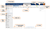
Click to view or hide: Example RME layout with key features highlighted
Default labels for options, fields and buttons are used in this help content;
these may be different if they have been personalised for your institution.
The main menu displays at the left side and provides access to records and eForms for distinct areas in RME, such as Projects, Ethics, HDR and Personnel. The menu options that display will depend on your role, access and permissions. Options may also be labelled differently for your institution. For screens smaller than 1024 CSS pixels wide, such as a tablet, the RME main menu will be collapsed by default to make the most of the screen space.
A menu toggle allows you to expand or minimise it as needed. When minimised, only the menu icons display along the left side.
From the menu, click a header to display the options available for that module. Core pages and eForm pages are located together under the relevant menu header. For example, to display a search page to find a Project record, click the Projects header and select the Projects option.
The list order for each module in the menu is: a) core search page, b) other core pages, alphabetically, with nested subordinate pages, and c) eForm pages.
Select a menu option to display the page. When the selected page opens, the main menu is automatically minimised.
For administrative functions, the following menu options may also be available, depending on your access:
• Crystal: To view and manage Crystal reports (reports designed in the RME Report Designer are access via a Reports button in the toolbar on a core search page or record, or eForm listing page or via the button in an eForm)
• Users: To set up and manage user details, roles, Page Views and labels
• Setup: To set up specific information used by your institution, such as account code formats, categories, classifications, org. units, external organisations, fund schemes panels, and so on.
• System: For system-wide settings, such as system preferences, product keys, user codes, or email templates
• Integrations: For feeders and other integration services, such as ARC, Feeders, NHMRC Grants Import, Symplectic, or TRIM
The breadcrumb trail at the top of the page aids navigation. It shows where you are in the RME page structure. You can click a page in the trail to display it.
If the available space for the breadcrumb trail is less than its full width, such as on a tablet, segments between Home and the current page being viewed will be truncated to a few letters followed by ellipses. For example, it could appear as: Home | HDR… | Stu… | Stu… | Exa… | Examiner Outcome. In some cases, these segments may even be blank depending on the screen width. To view the full name, you can mouse over the segment to display a tooltip. Each segment still works as a link to display the page from the trail. Each segment will be highlighted when you hover over it. The last page name in the trail will be displayed as much as is possible. RME is currently designed for computers and tablets, so if the screen size is very small, the name may be truncated.
When ORCID integration is enabled, the ORCID icon  displays to the right of the breadcrumb trail, initially with the
text option: Create or connect your ORCID
iD. On tablets, only the icon will display but it is linked
so it can be clicked. Registering your ORCID iD with RME automatically
populates relevant ID fields in the system, and also allows you to easily
access your ORCID account details from the icon at any time.
displays to the right of the breadcrumb trail, initially with the
text option: Create or connect your ORCID
iD. On tablets, only the icon will display but it is linked
so it can be clicked. Registering your ORCID iD with RME automatically
populates relevant ID fields in the system, and also allows you to easily
access your ORCID account details from the icon at any time.
To register your iD, click the icon or the text link Create or connect your ORCID iD. The ORCID website displays in a new tab. Enter your iD and password. Follow the prompts to authorise access.
If you don't have an ORCID iD, select this option to go to the ORCID website and create one. The ORCID system will send you an email to verify your email address.
When your iD is successfully registered in RME, confirmation displays. In a Personnel or Student record, as relevant, the Research Identifier related item will be automatically populated with the registered iD. The icon will now display on its own (with a tooltip). The text link will no longer display. You can click this icon to access your ORCID account any time.
ORCID preferences are managed in System Preferences.
The toolbar along the top of core search pages or eForm listing pages provides options to perform certain actions. When you scroll down on long pages, the toolbar will remain anchored to display at the top of the page so you can easily use the options.
Options depend on your permissions; if an option does not appear or is disabled (shown in gray), you do not have the required permission for it.
Some options display for both core search pages and eForm listing pages, while some are specific to one area. When you open a core record, the toolbar changes and has options relevant for that page. See: Core record toolbar.
Options for core record search pages and eForm listing pages:
Icon |
Label |
Description |
Usage |
|
Actions |
Provides access to administrative actions for a module or eForm page, such as:
Ethics eForms:
Ethics and Projects core: • Bulk Update to make the same change to multiple records at the same time
HDR eForms:
RPR eForms: • Application bulk update for status or workflow end state (eForms based on the same template) |
Only for use by administrative users with a relevant assigned page action in Page Views for the displayed page |
|
Clear |
Clears the search criteria you entered, for example, if you want to start over |
• RME core: Can be used by all users • eForms: Used by administrators |
|
Columns |
Used to configure the columns of the grid shown on the page For more, also see: |
Can be used by all users |
|
Copy |
Used to copy an eForm selected in the eForm page grid for Contracts, RPR and Ethics domains |
For Contracts, Ethics and RPR eForm listing pages Not available when displaying the Advanced search tab A Copy option is also available from the core record toolbar when you display a core record. |
|
Costing and Pricing Tool |
Used to access the Costing and Pricing Tool in the Projects module and RPR eForm domain |
Only displayed if the Costing and Pricing Tool is used |
|
Delete |
This option is dynamic and is used to delete a selected record or eForm, based on your permissions and the page you are viewing. Select a record or eForm by clicking the box in the first column of the grid so it is ticked and select this option in the toolbar to delete it. |
Not available in Basic or Advanced search tabs • RME core: All users with Delete permission for the relevant Page View and access to the selected record • eForms: All users with Allow Delete Application permission for the relevant Page View and access to the selected eForm |
|
Export |
This option is dynamic and is used to export either the record details or eForm details shown in the grid, based on the page you are viewing. When you select this option, a .csv file will be generated ,which is usually viewed in MS Excel. You may see a prompt from your browser asking what to do with the export file - open or save? This is often shown at the bottom of screen. |
Not available in Basic or Advanced search tabs • RME core: All users with Export permission for the relevant Page View and access to the selected record • eForms: All users with Allow Export permission for the relevant Page View and access to the selected eForm |
 |
Find |
Used to search for items matching the criteria you enter in the search fields; see: Search You can also press <Enter> to start the search. |
• RME core: All users • eForms: Administrators with Allow Manage Application permission |
|
New |
Used to create either a new core record, or a new eForm depending on the page you are viewing The new core record or eForm will open in the same browser tab, to replace the page you were viewing. |
• RME core: All users with access to the module • eForms: All users with Allow Create Application permission for the Page View |
|
This option is dynamic and opens either a core record or eForm based on the search/listing page you are viewing. To open a record or eForm, click the checkbox at the left of it in the grid so it is ticked, and then select this option in the toolbar. The record or eForm will open in the same browser tab.
Open multiple records or eForms If your browser settings allow popups, you can select and open more than one record or eForm at a time using this method. Multiple records or eForms open in separate browser tabs. If only one item opens in a new tab, check your browser settings. If you have multiple eForms open, concurrent checking will prevent your changes from being overwritten. For details, see: Saving and multiple user checking
Alternatively, you can click
the Open |
Only available in grids with lists of records or eForm, such as a Results tab or eForm listing page This button is only enabled when you make a selection in the grid. The selected item only opens if you have relevant access to the selected record or eForm.
|
|
|
Refresh |
Used to refresh the fields in a page when you have added or changed details |
RME core: All users, when applicable |
|
Used to view reports in core search and record pages, and eForm listing pages A popup displays to allow you to select a report group relevant to the module or domain, which then lists reports from that group. Select a report from the list. It will display in a separate browser window. • RME core: Used to open reports for core details. • eForm domain: Used to open reports about eForms. For details, see: RME Reports and View options and reports for an eForm. These reports are different to Crystal reports. |
All users with a role that has access to at least one report for the module or eForm domain |
|
|
Save |
Used to save the search criteria you defined so you can use it again later • Saved searches display from a dropdown to the top right of the page. • Manage your saved searches via the Session menu |
• RME core: All users • eForms: Administrators with Allow Manage Application permission |
The Columns button on the toolbar allows you to customise the layout of the grids shown on the page. It allows you to select the columns to display and/or reorder them. If you don't make any changes, columns will be displayed in the default order.
• From the dropdown, select the columns you want, and click Add. If the list is long, use the lookup to find the column you want - you can enter either a partial or full search term.
• Use the Up and Down arrows to change the order. The column listed at the top will be the first column shown on the left of the grid.
• To delete a column, select the Delete icon (rubbish bin) at the right.
So that you can see key details in grids in RME pages, columns are automatically adjusted. For some columns, a set width is applied, based on the following rules:
• If there are less than seven columns, not counting the first checkbox column, they are evenly distributed, regardless of the type of details in each column.
• If there are seven or more columns, they are automatically set with specific widths. For example, Description columns are set to 400 pixels wide, Title and Name columns are set to 350 pixels wide and number or code columns, such as Project Code, are set to 300 pixels. All other columns are set to 200 pixels.
To view a full column name if it is contracted, mouse over the column heading to display a tooltip.
You can expand or contract columns by using the mouse and the Resize indicator on the column header border. Be aware that these adjustments are only retained while you are viewing the grid. They are not saved if you go to a different RME page or log out.
If the width of the grid exceeds the width of the window, the horizontal scroll bar will display.
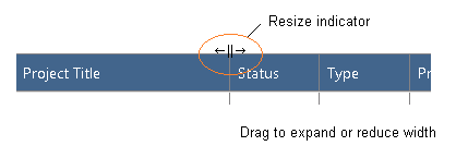
Example column Resize indicator
By default, columns in a grid are sorted by the first column of data from the left in ascending order, numerically then alphabetically (1 to 10+, then A to Z). An Up arrow indicates that the sort order is ascending, smallest to largest. For alpha-numeric values, numbers take precedence, for example: A1, Aardvark, Abacus … and so on.
Clicking the column header changes to the opposite order, in this case, descending (10+ to 1, then Z to A). The Down arrow indicates that the sort order is descending, largest to smallest.
To change the column you want the grid sorted by, click another column header. You can only sort by one column at a time.
When navigating back to a search or eForm listing page via the breadcrumb trail, the sort order from when you were previously on the page will be restored, unless it is a core related item grid within a record. Related item grids will always be sorted by the first column of data for technical reasons.
At the top right, your name displays with a dropdown that allows you to log off and manage some of your own settings, as follows:
Menu option |
Description |
Manage Dashboards |
If your institution uses dashboards, select this to manage the dashboards that display on your RME Home page. You may also be able to share dashboards with others, depending on your access and permissions. These personalised dashboards can provide at-a-glance views of relevant operational or general information. A dashboard is comprised of a set of widgets, which are predefined components that show different types of information, for example, a chart of your progress (Researcher), or a list all your students (Supervisor). Your institution may have defined the dashboard for you to select. You can also create your own dashboard with the predefined widgets available. Depending on permissions, you may also be able to share dashboards that you create with others.
For more, see: Dashboards |
Manage Saved Searches |
This is used to manage the search queries you have saved. You can delete or rename them. If you have the required permissions, you can also share them with others. For more, see: Manage Saved Searches |
User Preferences |
For your own reference, this option displays your username and preferred name as defined in RME. It also lists all the roles you have been assigned. |
UI Style This is used to control the look and feel of eForm pages (the user interface or "UI" for short). The default style that is set by your institution displays in the UI Style field. If there is more than one style sheet available, you can select one to apply a different style to eForm pages. To change the style: 1. From the session menu (your username), select User Preferences > UI Style and display the dropdown to see the list of available styles. 2. Select the style and click OK. The new style will be applied to all eForm pages in RME, and it will be saved as your preferred style.
|
|
Default Dashboard This dropdown allows you to select which dashboard to display automatically on your RME Home page if you have more than one. Only one dashboard can be set as the default. For more, see: Dashboards
|
|
Log off |
Select this to log out of the RME system. |
Throughout the system there are functions that allow you to enter details for or upload a document, either soft copy, path or hard copy. For details, see one of the following as relevant:
• RME core records: Document upload and management
• eForms: Document upload and management
Popups, sometimes called "dialogs" or "modals", are small windows that appear in the foreground of a page when a particular option is selected. The page behind is covered with a grey overlay to indicate that you cannot enter data or select options in it. This remains until the popup is closed.
In RME, popups can display in both core records and eForms for you to provide details or confirm actions.
Examples:
• The Copy button on the toolbar of a core record displays a popup for you to select which related items to copy for the new record, as shown in the example image below.
• In eForms, selecting a workflow action from the Toolbar panel on the right side for a custom review group displays a popup so you can add a new member.
• Search lookups are not popups.
You can move a popup to see content in the page behind it. Select the popup header bar and drag it to another location within the available screen space.
If you want to find a relevant part of a page behind a popup, you can use the scroll bar on the right. You can only scroll the page behind a popup; you cannot click any elements or otherwise interact with that page while the popup is open.
Click to view or shrink: Example core record popup
For large text entry fields (that allow more than a single line) in
core pages and eForm comments, a text editing toolbar offers a variety
of editing and formatting options, as follows:
Icon |
Label |
Description |
|
Bold |
Make the selected text thicker to stand out, for example, bold |
|
Italic |
Slope the selected text to the right for emphasis, for example, italic |
|
Underline |
Put a line under the selected text, for example, underline |
|
Strikethrough |
Put a line through the text, for example, strike through |
|
Superscript |
Display text in a small font above the text line, for example, 12th |
|
Subscript |
Display text in a small font below the text line, for example, N2 |
|
Fonts |
Select the text style, for example, Arial |
|
Paragraph style |
Show paragraph marks and formatting symbols in the text, such as Normal, Heading 1 |
|
Alignment |
Select text placement from the dropdown: • Align Left (default) • Align Centre • Align Right • Justified |
|
Bullets |
Create a list with bullets |
|
Numbering |
Create a numbered list |
|
Increase indent |
Move the selected text in |
|
Decrease indent |
Move the selected text out |
|
Find and replace |
Find a term or phrase in an editable text entry field and replace it with another 1. Complete the fields with a) the term or phrase you want to change, b) the term or phrase that replaces it. 2. Click
either the Replace single
arrow icon 3. To close it, click the cross x at the end of the row. |
|
Insert image |
Add a picture that is available online This does not insert an image from your file repository, such as a .png or .jpg file. The image must be available from an online location (http). You need to specify the image location and details, then select Insert Image: 1. Enter Image URL: Online web address of the image 2. Enter Alt Text: Description of the image for accessibility (use in screen readers) 3. Width: If you want to change the width, enter the new width (it is not directly proportional to the height, so you need to change that manually) 4. Height: If you want to change the height, enter the new height |
|
Insert link |
Add a static hyperlink, such as a website URL You can customise the text that displays for the link in the Enter link text field. If you don't change this, the link will display. If the link is already inserted into the content and you want to customise the link text later, select the link, then click this button on the text toolbar. In the Enter link text field, type the text you want to display then click the Insert link button in the editor. There is no validation to check if the URL is valid. |
|
Unlink |
Remove the hyperlink from the linked text |
|
Insert email |
Add a mailto: link so that recipients or users can email directly to the specified email address If you don't include mailto:// when entering the email address, it will be automatically included when it is inserted as a link. You can customise the text to display for the link in the Enter name field. If you don't change this, the exact link will display, including "mailto://". If the link is already inserted into the content and you want to customise the link text, select the link, then click this button. In the Enter name field, type the text you want to display then click the Insert link button. There is no validation to check if the email address is valid. |
|
Insert symbol |
Insert a symbol such as ©, ® or ™ |
|
Insert snippet |
For eForm comments only Insert a commonly-used phrase that is saved in RME for review purposes Start typing a word or phrase to view a list of matches. These are defined and saved in RME > Setup > Standard Phrases. This is a good way to save time for phrases or terms used often, and can ensure consistency.
|
The footer displays the RME version and build number. These details can be used when contacting the RMPL team for help and support. To see the latest version details, you may need to refresh the page manually as these are not automatically refreshed when the page is displayed for performance reasons; they are cached in the browser daily. Depending on your web browser, click the Reload or Refresh button, or try Ctrl + F5 or Shift + F5 keys.
The footer can be customised for your institution. For details, see: Custom Content.
The table below describes the types of pages you may encounter in RME:
Page type |
Description |
Core search page |
This type of page displays when you select the module option from the main menu, such as Projects, Ethics, Research Outputs, Contracts, HDR or Personnel. It allows you to search for and open core records for the module. A list of search results is automatically shown on the Results tab. For more, see: Search |
Core record page |
A core record page provides the full details for the record. The main core fields for the record display at the top. Related items for additional information of specific types are offered via tabs. Some display fields directly, while others display a summary grid. For more, see Core page layout or click the Help link when displaying the core record. |
Related item page |
A related item page displays the full details of the related item of a core record when you select an item from the summary grid in the core record page. The related item page includes fields and a grid of all items for the related item. To view another item, you can select one from the grid. A related item may also offer additional sub-items, essentially related items for a related item. For more, see: Core page layout - Related items and sub-items |
Sub-item page |
A page for a sub-item that displays in a related item page If there is more than one item, you can view the next or previous one via the toolbar. For more, see: Core page layout - Related items and sub-items |
eForm listing page |
This type of page displays when you select an eForm option from the RME menu. It shows eForms that you can access in tabs, depending on your role in the process Default tab labels: My Applications, For Review, For Assessment Review To create a new eForm in this type of page, click the New button on the toolbar. Administrators with relevant permissions can also search for, open and manage eForms in this page. |
eForm page |
This is an opened online form that has been selected from an eForm listing page or via a link. An eForm moves through a defined process from creation, approval or review, to a final outcome. For more, see: eForm layout and tools and Use an eForm |
ID: Getting_around.htm


 icon (next the checkbox) in the grid. See:


 to replace
terms one by one, or the
to replace
terms one by one, or the  to replace all
terms at once.
to replace all
terms at once.